Ricercatori canadesi hanno scoperto che una pagina web si valuta in due decimi di secondo. E il giudizio rimane

ROMA – Un battito di ciglia e l’internauta ha già valutato la pagina web. Gli utenti di internet decidono in fretta quali siti scartare, questo si sapeva, ma mai si sarebbe immaginato che per valutare una pagina bastano due decimi di secondo. Lo studio di alcuni ricercatori canadesi, apparso oggi sul sito di Nature, prova che gli utenti internet fanno le loro scelte in molto meno tempo di quanto fino a oggi si pensasse necessario: “I miei colleghi ritenevano impossibile si potesse davvero vedere qualcosa in meno di mezzo secondo – afferma Gitte Lindgaard, una delle autrici della ricerca – ma gli esperimenti hanno provato che le valutazioni si fanno nei primi due decimi di secondo di osservazione”.

I ricercatori hanno mostrato a dei volontari, nel minor tempo possibile, delle pagine web che erano state precedentemente valutate da altri come chiare e immediate oppure confuse. Ai loro è stato chiesto di valutare se le pagine fossero accattivanti e di fare una graduatoria, su questa base, delle migliori. Anche se le immagini si susseguivano in soli due decimi di secondo, i loro giudizi combaciavano con quelli fatti da chi aveva osservato le pagine per tempi molto più lunghi.

Che la prima impressione fosse quella determinante, nell’esprimere delle valutazioni, era cosa nota agli psicologi, meno che si formasse con questa velocità.
Gitte Lindgard spiega che la rapidità con cui i lettori valutano una pagina web è frutto dei “pregiudizi cognitivi”. Alla gente piace aver ragione, secondo la ricercatrice canadese, perciò continuare a usare un sito web che si è giudicato bene alla prima impressione aiuta a provare a se stessi che si è presa una decisione iniziale corretta.

Non è un fenomeno ristretto a internet, ma che pervade la nostra società, come dimostrano studi fatti in altri campi. “E’ terribile, se ci riflettiamo, ma la tendenza ad anticipare le conclusioni è molto più frequente di quanto si pensi”, osserva Lindgard.

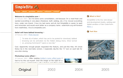
Sui “congnitive bias”, i pregiudizi cognitivi, i web designer lavorano da tempo, sfruttando anche quello che gli psicologi chiamano “effetto alone”. Se si riesce a prendere al laccio il lettore con un buon design si fanno passare in secondo piano le pecche del sito e l’utente è portato a valutare in maniera più accomodante la pagina nell’insieme. La scoperta degli scienziati canadesi non fa che confermare la velocità di internet, per quanto riguarda invece le scelte dei web designer è Marc Coudron, dell’agenzia londinese Pod1 a dare le ultime tendenze. “La differenza tra una pagina che funziona e una scadente è spesso la velocità di caricamento – dice Coudron – altrimenti l’utente potrebbe stancarsi prima ancora di aver avuto al prima impressione”.

L’uovo di Colombo: prima di tutto vedere. Sul vedere cosa, Caudron parla di una nuova tendenza degli utenti: “l’approccio puritano”. La gente vuole informazioni nella maniera più veloce e più semplice possibile, perciò fondamentale è rifuggire la tentazione di mettere su una pagina web più roba possibile. E’ la vecchia questione delle scelte, storia molto più vecchia del web.

Font… basta con Verdana e Arial!!!

LUCIDA GRANDE un font interessante … Lorem ipsum dolor sit amet, consectetuer adipiscing elit, sed diam nonummy nibh euismod tincidunt ut laoreet dolore magna aliquam erat volutpat.

Così come HELVETICA … Duis autem vel eum iriure dolor in hendrerit in vulputate velit esse molestie consequat, vel illum dolore eu feugiat nulla facilisis at vero eros et accumsan et iusto odio dignissim qui blandit praesent luptatum zzril delenit augue duis dolore te feugait nulla facilisi.

Thinking Outside the Grid

With today’s technologies and techniques, we are free to create grid designs—or we can choose to break out of grids completely. That such choice can empower a web designer is unquestionable: the true challenge lies in the way we bring ourselves to “lose small mind” and think outside the grid.

Table layouts are great for grid designs. The markup itself reproduces a specific grid, and the tendency is for us to just fill up the boxes with the images, type, and interface elements that make up our design. If we do create a deconstructed or spontaneous design with any visual complexity, we have to use a lot of images within the document to achieve the results, making documents weighty and overly complicating the markup.
CSS changes all that, and this is why I theorize, along with many others, that we’ve not yet learned to design for the web. What we’re just beginning to understand—particularly those of us who come to CSS layouts after years of working with tables—is that the visual model for CSS is far more conducive to breaking out of the grid and designing for discrete, semantic elements.
The CSS visual model is all lines and boxes. That’s the stuff of grids, right? Well sure, if we want it to be. This is where the fundamental difference is. CSS allows us to take a box—any box—and do with it what we want, independent of its surrounding boxes.
We can use a position property or float the box, and we can add lightweight images to element backgrounds. So while we’re still working with boxes, we can present those boxes in numerous visual as well as technically efficient ways.
The beauty and challenge of working with modern layouts is that now we have options. With CSS, we have a means of creating manageable, lightweight, visually rich designs that can be grid designs if we want them to be. But we can also easily deconstruct the grid or dispense with it entirely.

.:: by Molly E. Holzschlag | read the article

Ma cos’è un trackback???

Il TrackBack è un sistema che permette la comunicazione automatica tra blog: immagina di aver letto un intervento interessante su un blog di qualcun altro, e di voler scrivere una risposta o un commento facendo riferimento all’articolo originale. Potresti farlo scrivendo un commento su quel blog, ma invece vuoi pubblicare il tuo intervento sul tuo blog.

Se quel blog è dotato di TrackBack, puoi inviargli automaticamente un segnale dal tuo blog chiamato “ping”, avvertendolo di aver scritto qualcosa che fa riferimento a quell’articolo. Ovviamente il tuo blog dovrà essere dotato di un sistema che ti permetta di inviare i ping specificando:

– il permalink del tuo articolo sul tuo blog
– il titolo dell’articolo
– un breve riassunto, chiamato excerpt, del tuo articolo
– il nome del tuo blog

Una volta ricevuto il ping, il blog destinatario aggiornerà automaticamente una lista di tutti i blog che fanno riferimento a quel particolare intevento, permettendo ai visitatori del blog di leggere le risposte sui siti di provenienza.

In questo modo verrà creato automaticamente un network di siti che si richiamano l’un l’altro, guidando l’utente attraverso percorsi tematici. Praticamente, un mega-blog sulla cui rete si dipanano le varie discussioni.

Il TrackBack è un sistema messo a punto da MovableType, la quale non ha voluto limitare l’utilizzo di questa possibilità ai propri utenti, ma ha deciso di divulgarne le specifiche in modo che anche i blog non basati sulla sua piattaforma possano usufruire dei vantaggi e delle opportunità del TrackBack

A Study of Blogs and Usability

Most “classic” blog functions include:
• RSS subscription mechanisms (XML buttons)
• Main page with both full and truncated postings
• Landing pages with full postings and comment mechanisms
• Previously posted comments
• Recent posts
• Trackback capabilities and recent trackbacks
• Archives
• Recent comment logs
• Author photos and contact information
——————————————————————————————
• Visitors may not recognize they are on a blog – both because they have not knowingly seen one before, and because they are most likely to enter one at the post, rather than at the main-page, level.
• Blogs do not always identify themselves – particularly on lower-level pages – literally as blogs.
• Classic blog indicators, such as authorial photos, short-form writing, or the presence of categories and archives, are not signifiers for mainstream web users.
• The core purpose of submitting comments to a blog is not universally understood, and the design of the comment function may have to take this better into account.
• Few, if any, blogs declare exactly what will happen when a post is submitted – though some indicate after submission that there will be a review. Doubt about whether or not an obviously non-offensive comment will get posted could have a dampening effect on a core tenet of blogging: real-time reader/author dialogue.
• RSS terminology and mechanisms are powerful – but currently also not easily understood.
• Without a call to action and perhaps an explicit assurance, most people will ignore even brightly-marked XML buttons.
• The fear of spam and spyware cannot be underestimated, as it seems that mainstream experience with the web is teaching users to be extremely wary of persistent or automated functions that are not enabled through trusted sources.
• The connections between current, past, and topically-organized posts – is not easy to grasp as they are currently rendered in many blogs.
• Individualized category names in particular are misleading to casual browsers.
• Organizational connections between higher- and lower-level pages on blogs generally flow better in only one direction: from the top down. But current web behavior rarely adheres to that convention.
• RSS works against top-down navigation of blogs.
• Mainstream consumer expectations for assistance, education and context far outstrip implementation of blog interface and feature elements.

.:: Catalyst Group Design | download the article

Good Designers Redesign, Great Designers Realign

The “redesigners”
The Redesigners often rely on emotional responses to aesthetics in justifying a redesign. You’ll typically hear statements like these:
“It’s been 2 years since our last redesign.
Our current stuff just looks old.
A redesign would bring new traffic to the site. ”

Too often, look and feel, color scheme, layout, and identity are presented as solutions to problems discussed in these conversations long before regard is given to other less-aesthetic issues that may very well be the root of the problem. The old warning against treating symptom rather than cause comes to mind.

The “realigners”
In direct contrast to the Redesigners, the Realigners cite strategic objectives and user needs as reasons to consider a site overhaul:
“Market trends have shifted. Should our website be adjusted accordingly?
Our users’ needs have changed. Do we need to adapt?
We’ve added 3 new sections and a slew of new content to the site over the last 12 months. Are we presenting content as effectively as we can?
Our current website does little to convey the strength of our product offering.
Does our online presence enhance or devalue our overall brand perception? ”

exampleThus, the differences between Redesigners and Realigners might be summarized as follows: The desire to redesign is aesthetic-driven, while the desire to realign is purpose-driven. One approach seeks merely to refresh, the other aims to fully reposition and may or may not include a full refresh.

Converting to realignism
– Ensure a “raison d’être” exists. What are the reasons/objectives/purpose for realigning? I typically reserve a line in my clients’ project summaries specifically for this item, What is the raison d’être for this project? Remember to say no just as much as you say yes.
– Determine what level of realignment is required. Will minimal changes suffice, or is a total revamp necessary? A solid raison d’être will aid in answering this question.
– Evaluate user switching costs. What will the impact be to users of the site? How will they be forced, enticed, or encouraged to mentally “switch” to the realigned design and any changes to the user interface, navigation, color scheme, etc.?
– Determine the impact on launch plans.

view complete article>>

Design Choices Can Cripple a Website

“Be aware that however strong the copy and text on a page, its performance is very much dependent on the way in which it is presented. In other words, design choices can enhance or diminish the power of the words.

Talk with your writers. Ask them how they think the message would best be presented. Then test some different versions. A good writer should have some strong instincts when it comes to the layout of the text.

The amount of “white space” on a page gives the content space to “breathe”

.:: Nick Usborne