my favourite …
https://tackk.com/productivity-diet
https://tackk.com/12-tips-for-staying-inspired
https://tackk.com/arix
Category: while surfing
within my profession
ideas for a new website
CSS @ Ten: The Next Big Thing
A dieci anni dalla nascita dei CSS un interessante articolo di Håkon Wium Lie sui Web Fonts
Link di interesse a due font designer:
Ray Larabie
Dieter Steffmann
.:: article
Services (that’s what I do)
Visual identity
– Online communication >>interface design for flash and HTML website as well as for web applications
– Offline communication >>Logo, ID package (business cards, stationary, envelopes, stamp, etc.)
– Project managment and counselling
Verbal identity
– naming, slogan conception, content management
Communication strategy
– Case study
– Personalized document research
– Conception of the communication rules
Web services
– Project management and counselling
– Implementation of flash and HTML websites
– CMS (Content Management System)
– Web applications
– E-commerce platforms
– Search Engine Optimization (SEO)
– Hosting
– Technical support
Naming
Successful naming is a powerful force in the branding process, marketing and advertising campaigns. It will differentiate you from the competition, provoke an emotional link between you and your audience and helps you to build a brand that stands for your customers passions. A powerful name is the result of a strong positioning strategy. The basic elements of a verbal identity are the name and the slogan. We use slogans to describe the company’s field of activity or to emphasize certain qualities/values.
Visual identity
The basic elements which form the visual part of a logotype are: name, graphical symbol, font and colour.
The primary goal of a logotype is to show the company’s personality as well as its values. Logotypes are vital in the moulding of a perception about the company, because it acts 80% at a subconscious level and we perceive 20% as visual releaser, faster and more efficient than words. As a conclusion, we tend to judge a company’s identity through a focal point, its symbol.
Cos’è Il Web 2.0: Definizione E Mini-Guida Di Robin Good
Il Web 2.0 è una nuova visione di Internet che ha appena cominciato ad influenzare il vostro modo di lavorare ed interagire con le informazioni in rete.
Web 2.0 non è un software specifico, nè un marchio registrato dai Microsoft o Google, ma un un insieme di approcci per usare la rete in modo nuovo e innovativo.
Web 2.0 si riferisce alle tecnologie che permettono ai dati di diventare indipendenti dalla persona che li produce o dal sito in cui vengono creati. L’informazione può essere suddivisa in unità che viaggiano liberamente da un sito all’altro, spesso in modi che il produttore non aveva previsto o inteso.
Questo paradigma del Web 2.0 permette agli utenti di prendere informazioni da diversi siti simultaneamente e di distribuirle sui propri siti per nuovi scopi.
Non si tratta di derubare gli altri del loro lavoro per il proprio profitto. Anzi, il Web 2.0 è un prodotto open-source, che permette di condividere le informazioni sulle quali è stato creato Internet e rende i dati più diffusi. Questo permette nuove opportunità di lavoro e di informazioni che possono essere costruite sopra le informazioni precedenti.
Web 2.0 lascia ai dati una loro identità propria, che può essere cambiata, modificata o remixata da chiunque per uno scopo preciso. Una volta che i dati hanno un’identità, la rete si sposta da un insieme di siti web ad una vera rete di siti in grado di interagire ed elaborare le informazioni collettivamente.
Il Web 2.0 è costruito con tecnologie come Ajax, un approccio di sviluppo web basato su JavaScript ed il linguaggio di programmazione XML. Questa miscela di tecnologie permette alle pagine di funzionare più come applicazioni per il desktop che come pagine di contenuto statico antiquate che troviamo di solito sul web.
Tim O’Reilly ha scritto un bellissimo articolo che spiega in modo molto approfondito che cos’è il web 2.0
Tramite i siti potenziati con Ajax, gli utenti possono interagire con le informazioni nelle singole pagine come se stessero usando un’applicazione, abbandonando la vecchia metafora del web come percorso di navigazione sequenziale in mezzo a pagine statiche.
Il web 2.0 prospera su di un’altra bellissima tecnologia di nome RSS. Come molti di voi sanno, gli RSS permettono agli utenti di ottenere aggiornamenti automatici non appena un sito cambia, anziché controllarlo ogni volta per avere le ultime informazioni. Basta semplicemente iscriversi al feed RSS del sito e non appena il contenuto di tale sito cambia, viene automaticamente inviato al vostro lettore o aggregatore di RSS.
Tramite gli RSS, il Web 2.0 inserisce il turbo e viene ampiamente usato per ricercare, filtrare e remixare le notizie, gli articoli ed altri tipi di contenuto in nuovi oggetti di informazione. E’ proprio nel remixare, nella selezione competente e nella giustapposizione del contenuto e delle informazioni esistenti che risiede il grande potenziale di web 2.0.
Alcuni grandi esempi di web 2.0 includono Andale.com, un sito che analizza le informazioni di vendita da eBay e le fornisce agli utenti, così essi possono trarre maggior vantaggio dal sito di aste. Un altro è HousingMaps.com, un sito creato da Craigslist.org e Google Maps, ma non affiliato ufficialmente a nessuno dei due. HousingMaps combina gli annunci immobiliari di Craigslist con l’abilità di Google Maps di vedere velocemente un’immagine satellitare dell’indirizzo esatto.
Tutte queste applicazioni web hanno creato nuovi servizi costruiti sulle informazioni esistenti, sui dati ed i servizi e riutilizzano quelle informazioni in modi non previsti dal loro ideatore originario.
Questo mix rivoluzionario crea tante nuove opportunità di lavoro sia per gli ideatori che per i consumatori, rendendo possibile la creazione di molti servizi nuovi, utili ed innovativi.
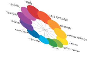
Playing with… color wheels
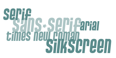
Font families
The importance of being… white!
The space surrounding this block of text is just as important as other factors such as appropriate use of color, type and graphics. I know, there is a tendency, specially on the web, to fill every single corner with text. White space is evil, seems to be the rallying cry,it must be removed! Down with white space!
The funny thing is that, most of us have been taught since elementary school to use white space. I remember how my teachers would always insist that we draw a 1.5″ margin on the left hand side of every page. They drilled it into our minds, until it became a habit that I have been unable to break, even to this day. Which is actually a good thing, since my handwriting is atrocious.
So why is white space so important? Part of the reason is pshychological, and part of it is physical: the text needs room to breathe. When text crowds all the way to the edge, it leaves us feeling crowded and cramped. Long passages of text, written edge to edge can actually tire the eyes.
Try it for yourself. Take a sheet of plain paper, and write several lines of text from one edge of the page to the other, without leaving any space at the top or the left and right margin. Now take another sheet of paper and right in the middle, write a few lines of text right in the middle, leaving a generous amount of white space on all sides (say 21/2″ on the left and right, and 4″ on the top.) Now compare the two pages. Which one is easier to read?
By the way, note that white space doesnt always have to be white. It can be any other color. White space refers to any empty area (colored or white, opaque or transparent) that is devoid of text.
This column itself, you might notice is surrounded by a generous amount of white space. This combined with a smaller column width, improves the readability of the text and makes it that much easier to read.
Another reason for using white space is related to a topic that I will revisit in more detail in a later column: contrast. Surrounding a block of text with a lot of white space, can actually draw the reader in, especially in a crowded layout such as a newspaper, where every nook and cranny is jam-packed with information.
Like this text, for example.
You might find your eyes being drawn to the text above. Thats the power of white space. Often times, in newspapers like the Wall Street Journal or New York Times, you will find full page ads with almost nothing else on the page except one lone sentence of text. You might think it rather silly, that a company would pay thousands of dollars to pay for this full page ad, and then not take advantage of it by filling it with text, messages and what not. And yet, you might find it impossible to skip that ad, as you browser through the paper, try as you might. That’s the power of white space, baby (and contrast.)
So the next time, you find yourself preparing a report, a newsletter, or an ad for a garage sale, think about white space. The first time you do it consciously, you might find it difficult (I know. I did.) But eventually you will get used to it, and wonder how you did without it.
.:: from “designmatters“
Whitespace
L’importanza dello spazio bianco
di: Mark Boulton
“Whitespace”, “spazio bianco” o “spazio negativo” è lo spazio tra gli elementi in una composizione grafica. Più in dettaglio, lo spazio tra gli elementi più grandi è definito “macro whitespace”. I “micro whitespace” -lo avrete facilmente intuito- sono invece gli spazi tra gli elementi più piccoli: per esempio tra gli item di una lista, tra la didascalia e l’immagine, tra le parole o tra le singole lettere.[…]
Lo spazio tra gli elementi più piccoli può avere un grande impatto sull’efficacia complessiva del design.[…]
I designer usano spesso il whitespace per creare un senso di sofisticatezza ed eleganza nella promozione di certi brand. Abbinato ad un uso intelligente della tipografia e della fotografia, uno spazio bianco generoso è spesso tipico delle promozioni di beni di lusso. I produttori di cosmetici, ad esempio, usano molto il whitespace nel loro materiale promozionale per comunicare al lettore che sono sofisticati, che esprimono una qualità superiore, e che in genere fanno prodotti costosi.[…]
Quando lo spazio bianco è usato per per guidare il lettore da un elemento all’altro, è chiamato “whitespace attivo”. Il whitespace passivo crea spazi di respiro ed equilibrio. È importante. un esempio
C’è questo articolo mooolto ma mooolto interessante
CURRENT WEB STYLE
Simple layout
Basta con poveri occhi che girano cercando di scoprire cosa guardare… l’esperienza è quella di una lettura semplice dall’alto in basso!
Centered orientation
basta con l’allineamento fisso a sinistra o con un layout liquido. Scrolliamo le pagine senza problemi a tutto vantaggio dello spazio bianco e dell’interlinea!
Design the content, not the page
basta decorare!!! Dobbiamo comunicare! Basta con i box, benvenuti effetti 3D per enfatizzare il contenuto. E’ quello che dobbiamo disegnare
3D effects, used sparingly
impariamo ad usare leggermente i gradienti per dare spazio al background, o enfatizzare un’icona o un contenuto. Reflections e fades sono prevalenti. Drop-shadows vanno usate con cura. Trademark round flashes sono dappertutto.
Soft, neutral background colours
la base dev’essere soft per dare evidenza ai colori forti del contenuto
Strong colour, used sparingly
sulla base soft i colori forti ed i c ontrasti sono l’optimum
Cute icons, used sparingly
basta usare troppi elementi attraenti! Poche icone forti
Plenty of whitespace
aria fresca, una boccata d’aria, un gran respiro!!! Ill nostro occhio ha bisogno di spazio. Ovviamente si parla di spazio e non di bianco, attenzione!
Nice big text
ovviamente non tutto esagerato! Il testo più importante avrà dimensioni maggiori, ma il tutto moderatamente